Mobile Visual Editor
Overview
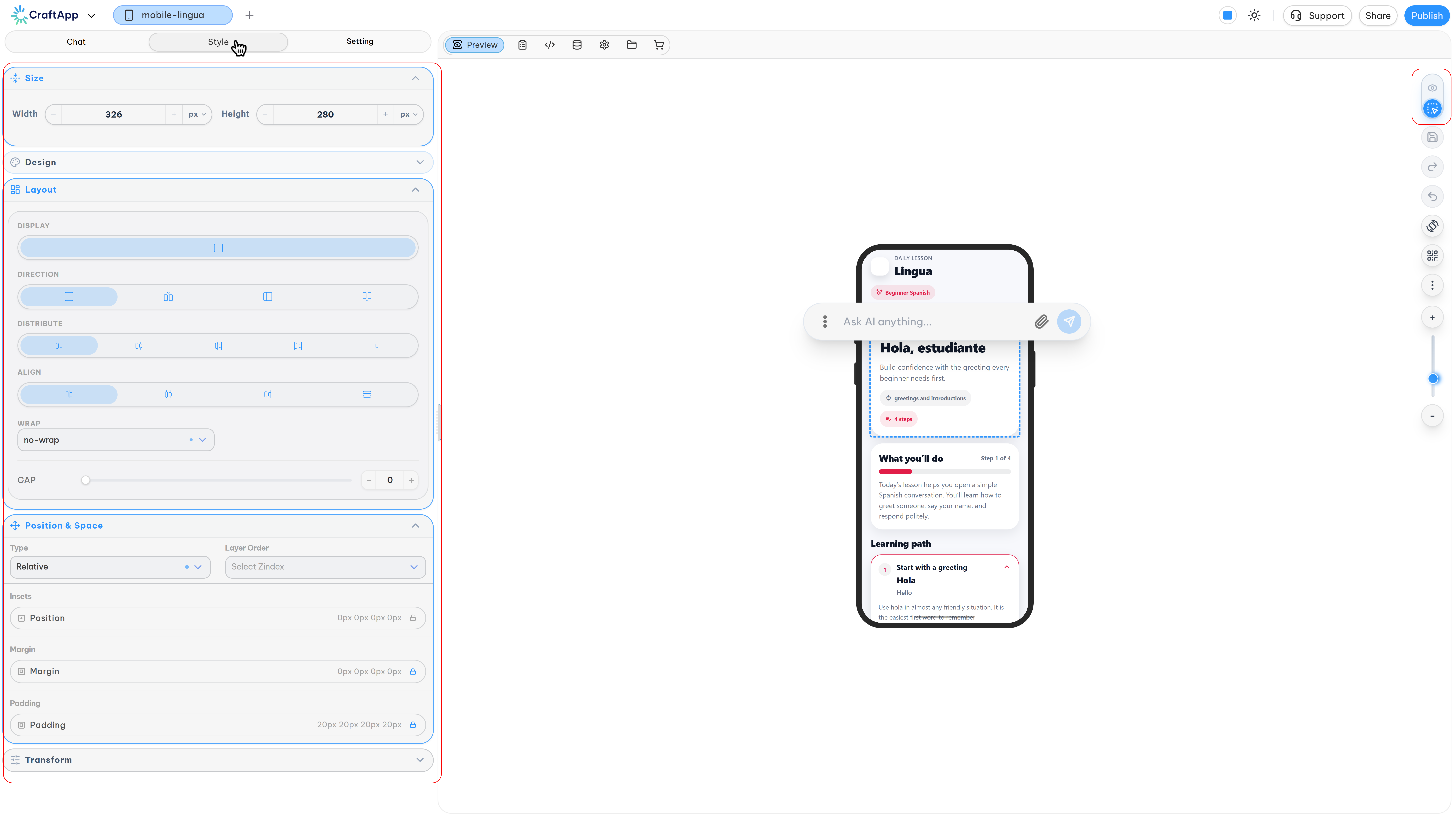
The Mobile Visual Editor lets you design your mobile app's interface directly — no AI interaction required. It gives you full, hands-on control over every element's size, appearance, positioning, and transformation.
Accessing the Editor
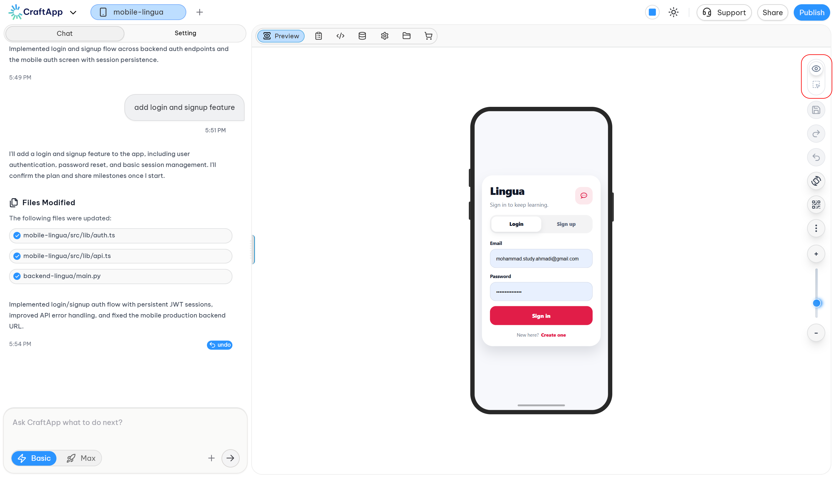
- Switch your project from Preview to Edit mode using the toggle in the top-right of the preview panel.
- In Edit mode, every element in your app becomes selectable.
- Selecting an element automatically opens the Style tab — a third tab that appears between Chat and Setting (hidden by default, and only visible while editing).
Style Categories
The Style panel is organized into four categories, each controlling a different aspect of the selected element:
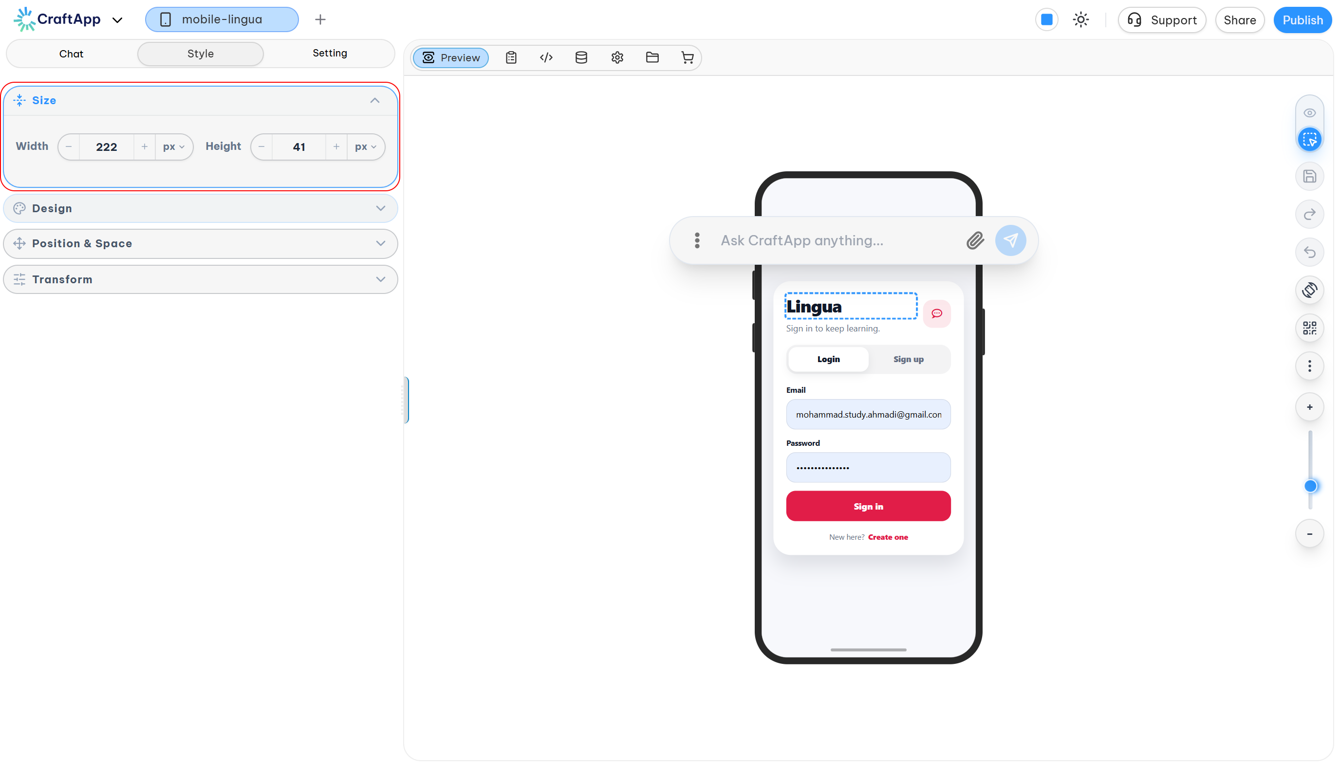
- Size
- Design
- Position & Spacing
- Transform
1. Size
- Width & Height — adjust using the
–/+controls on each input, or enter a value directly. - Units —
px,%,rem
2. Design
Four subsections cover every aspect of an element's appearance.
Background
- Set background color and text color
- Adjust color opacity
- Pick colors visually with the built-in color picker
- Choose between RGBA and HSLA color formats
- Blend colors using 15+ blend modes
- Select from a predefined color palette for quick styling
(Text color follows the same controls as background.)
Shadow
Two shadow types are available:
| Type | Use Case |
|---|---|
| Box Shadow | Adds depth around an element's container (e.g. a card or button) |
| Text Shadow | Adds a glow or emphasis around text glyphs |
Each type offers:
- Presets — ready-to-use shadow styles
- Custom — full control over:
- Color
- Opacity (0–100%)
- X Offset
- Y Offset
- Blur
- Spread (box shadow only)
Text
Eight properties control how text looks and reads:
- Font Family — the typeface applied to the selected text
- Font Weight — thin, light, regular, semi-bold, bold, and other available weights
- Direction — LTR (e.g. English, French, Spanish) or RTL (e.g. Arabic, Persian). Setting this correctly is essential for multi-language apps — an incorrect direction makes RTL text unreadable.
- Alignment — Start, Justify, Center, End
- Transform — Capitalize, Uppercase, Lowercase
- Font Size — adjust via
–/+or a slider - Letter Spacing — adjust via
–/+or a slider - Decoration — Underline, Overline, Line-through
Border
- Border Color
- Border Style — Solid, Dashed, Dotted
- Border Width — set all sides at once, or click the chain icon to unlink and adjust each side (top/right/bottom/left) independently
- Border Radius — controls corner rounding, with the same linked/unlinked behavior as width
3. Position & Spacing
Controls where an element sits on the page.
- Position Type
Relative— the element stays in its normal place but can be offset with top/left/right/bottom; it also becomes the reference point for any absolutely positioned children.Absolute— the element is removed from normal flow and positioned relative to its nearest positioned ancestor.
- Layer Order (z-index) — bring an element forward or send it backward relative to others.
- Position Insets — a shorthand for setting top/right/bottom/left offsets together.
- Margin & Padding — margin is the space outside an element; padding is the space inside it, between the content and the border. Both support independent top/right/bottom/left values.
4. Transform
Changes an element's visual appearance, position, size, or angle — without affecting the page layout.
| Control | What It Does |
|---|---|
| Rotation | Rotates the element around its center (0°, 45°, 90°, -45°, etc.) |
| Position Offset (X/Y) | Moves the element — X: left/right, Y: up/down |
| Scale (X/Y) | Resizes the element — 1 = original size, 2 = 200%, 0.5 = 50% |
| Skew (X/Y) | Tilts the element horizontally or vertically |
Maps to CSS transform: rotate(), translate(), scale(), and skew().