Web Visual Editor
The CraftApp Visual Editor is a no-code interface for designing, customizing, and refining your application's UI. It allows direct manipulation of elements, with all changes synced to your project's structure and version history.
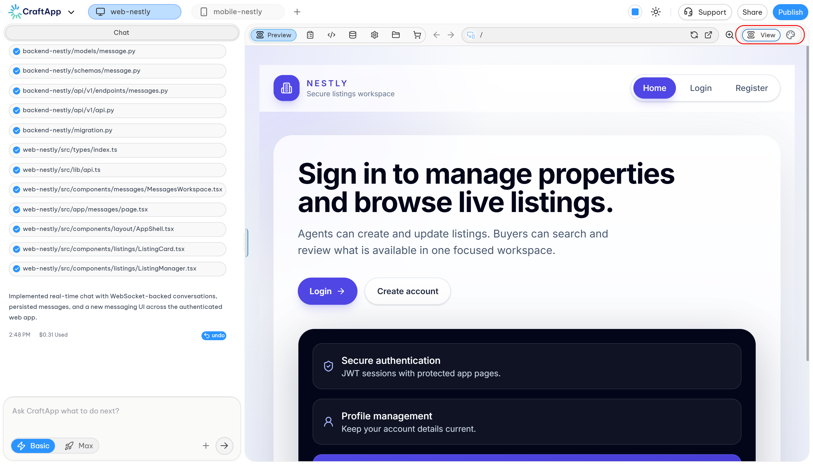
- To begin, switch your project to Edit mode.
- In View mode, you interact with the app as an end user.
- In Edit mode, clicking an element opens its properties in the editor panel.
Tip: Toggle between modes using the switch in the top-right corner of the Studio.
Element Selection
In Edit mode, click any element in the preview (e.g., Text, Button, Section) to select it.
- The selected element is highlighted.
- Its editable properties appear in the left sidebar.
Visual Editor Panel
The editor panel organizes properties into eight main categories. The availability of some categories depends on the selected element type.
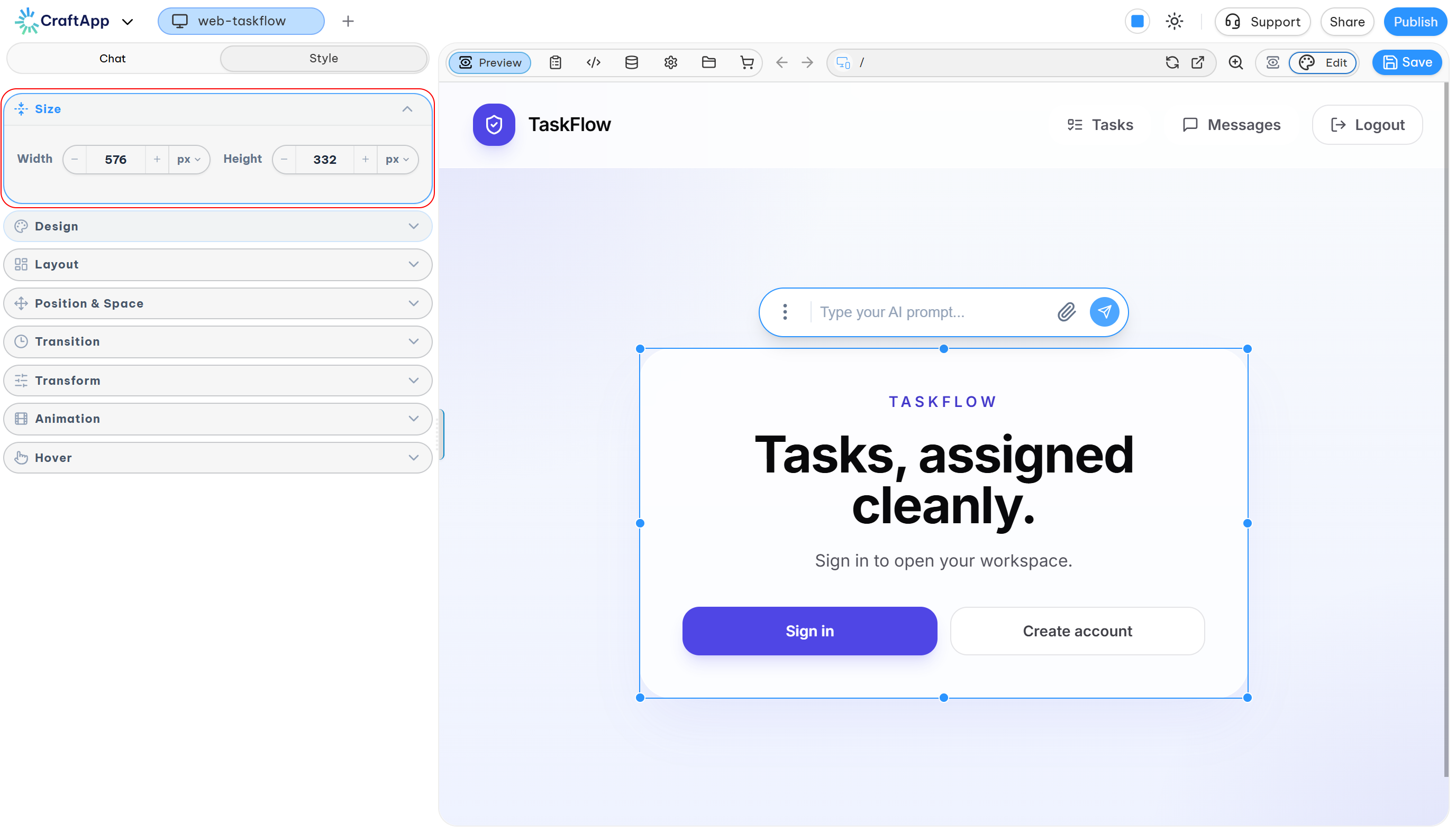
1. Size
Controls the dimensions of the selected element.
- Width & Height: Two separate inputs are provided. Enter a value directly or use the
-/+buttons. - Units: Supports
px,%, andrem.
2. Design
Configures the visual appearance of an element. It contains five sub-sections: Background, Shadow, Text, Border, and Opacity.
Background
- Fill: Sets the background color via a color picker, palette, or preset swatches.
- Blending: Defines how the background color blends with surrounding elements.
- Opacity: Controls the transparency of the background color.
- Image: Sets an image as the background. Upload a file from your device or provide a public image URL.
Shadow
Adds shadow effects. Two types are available:
- Box Shadow: Applies a shadow to the element's container.
- Text Shadow: Applies a shadow to the text inside the element.
Each type offers:
- Presets: A selection of pre-defined shadow styles.
- Custom: Fine-tune the following parameters:
- Color: Sets the shadow color.
- Opacity: Sets the shadow's transparency (0-100%).
- X Offset: Horizontal position of the shadow.
- Y Offset: Vertical position of the shadow.
- Blur: Softness of the shadow edge.
- Spread: (Box Shadow only) How far the shadow expands.
Text
Dedicated to text styling. Available properties:
- Font Family: Selects the typeface.
- Font Weight: Sets the thickness (e.g., Thin, Bold, Semi-Bold).
- Direction: Sets text flow as
LTR(Left-to-Right) orRTL(Right-to-Left) for languages like Arabic or Hebrew. - Alignment: Positions text within its container (
Start,Justify,Center,End). - Transform: Changes text casing (
Capitalize,Uppercase,Lowercase). - Font Size: Adjusts text size via slider or
-/+buttons. - Letter Spacing: Adjusts space between characters.
- Word Spacing: Adjusts space between words.
- Text Indentation: Adds space before the first line of text.
- Decoration: Adds visual lines to text (
Underline,Overline,Line Through).
Border
Defines the line around an element.
- Color: Sets the border color.
- Style: Sets the line style (
Solid,Dashed,Dotted). - Width: Sets border thickness. Use the link icon to adjust all sides at once or unlink to set
Top,Right,Bottom, andLeftindependently. - Radius: Rounds the corners. Like width, can be set for all corners at once or independently.
3. Layout
Defines how an element is displayed and how its children are organized.
Display Modes:
block: Takes full width and starts a new line.inline: Flows with text; width and height are ignored.inline-block: Flows with text but respects width and height.flex: Enables a one-dimensional Flexbox layout.grid: Enables a two-dimensional CSS Grid layout.
Flexbox & Grid Settings:
- Direction: Sets the main axis (
row,column,row-reverse,column-reverse). - Distribute (Justify-Content): Aligns items along the main axis (
start,center,end,space-between,space-around,space-evenly). - Align (Align-Items): Aligns items along the cross axis (
start,center,end,stretch). - Wrap: Controls if items stay on one line or wrap (
no-wrap,wrap,wrap-reverse). - Gap: Sets the spacing between items using a slider or input.
4. Position and Spacing
Controls the placement and spacing of an element.
- Position Type:
static: The element is positioned according to the normal flow of the page.top,left, etc., have no effect.relative: The element is positioned relative to its normal position. It remains in the document flow, and insets will move it from its original spot.absolute: The element is removed from the normal flow and positioned relative to its nearest positioned ancestor. It does not take up space.fixed: The element is removed from the flow and positioned relative to the browser window. It stays in place on scroll.sticky: The element behaves asrelativeuntil it hits a scroll threshold, then it behaves asfixed.
- Layer Order (z-index): Controls the stacking order. Elements with a higher value appear in front.
- Position Insets: Sets the
Top,Right,Bottom, andLeftoffsets for non-staticelements. - Margin: The space outside the element's border.
- Padding: The space inside the element's border, between the content and the border. Both can be adjusted for all four sides.
5. Transition
Controls how an element smoothly changes from one state to another over time.
- Triggers: Select when the transition occurs (
Hover,Focus). - Options:
- Presets: One-click effects like
Grow,Shadow Lift, andSlide Lift Accent. - Custom: Manually configure the following:
- Property: Which properties to animate (e.g.,
All,Transform,Color). - Timing: The duration of the transition in seconds.
- Delay: A pause before the transition starts.
- Ease: The acceleration curve (
ease,ease-in,ease-out,linear).
- Property: Which properties to animate (e.g.,
- Presets: One-click effects like
6. Transform
Alters an element's visual appearance (position, rotation, scale) without affecting the layout flow.
- Rotation: Rotates the element around its center point (in degrees).
- Position Offset: Moves the element from its original spot using
X(horizontal) andY(vertical) axes. - Scale: Resizes the element using
XandYaxes. A value of1is the original size. - Skew: Tilts or slants the element along the
XorYaxis (in degrees).
7. Animation
Creates complex, multi-step effects using keyframes.
- Presets: Pre-built animations grouped by type:
- Entrances: For elements appearing on screen (
Fade In,Slide In,Zoom In,Bounce In). - Exits: For elements leaving the screen (
Fade Out,Slide Out). - Attention: To draw focus without moving the element permanently (
Pulse,Shake).
- Entrances: For elements appearing on screen (
- Custom: The animation builder provides full control:
- Sequence Explorer: A timeline to add keyframes at different points (e.g.,
0%,50%,100%) and define the animation's state at each step. - Behavior: Configures how the animation plays:
- Repeats: The number of times it plays (or
Infinite). - Direction:
Normal,Reverse,Alternate,Alternate-Reverse.
- Repeats: The number of times it plays (or
- Start Delay: A pause before the animation begins.
- Duration: The time for one full animation cycle.
- Sequence Explorer: A timeline to add keyframes at different points (e.g.,
- Animatable Properties:
- Appearance:
Fill(background color),Text Color,Opacity. - Transform:
Rotation,Position Offset (X/Y),Scale (X/Y),Skew (X/Y).
- Appearance:
Managing Changes
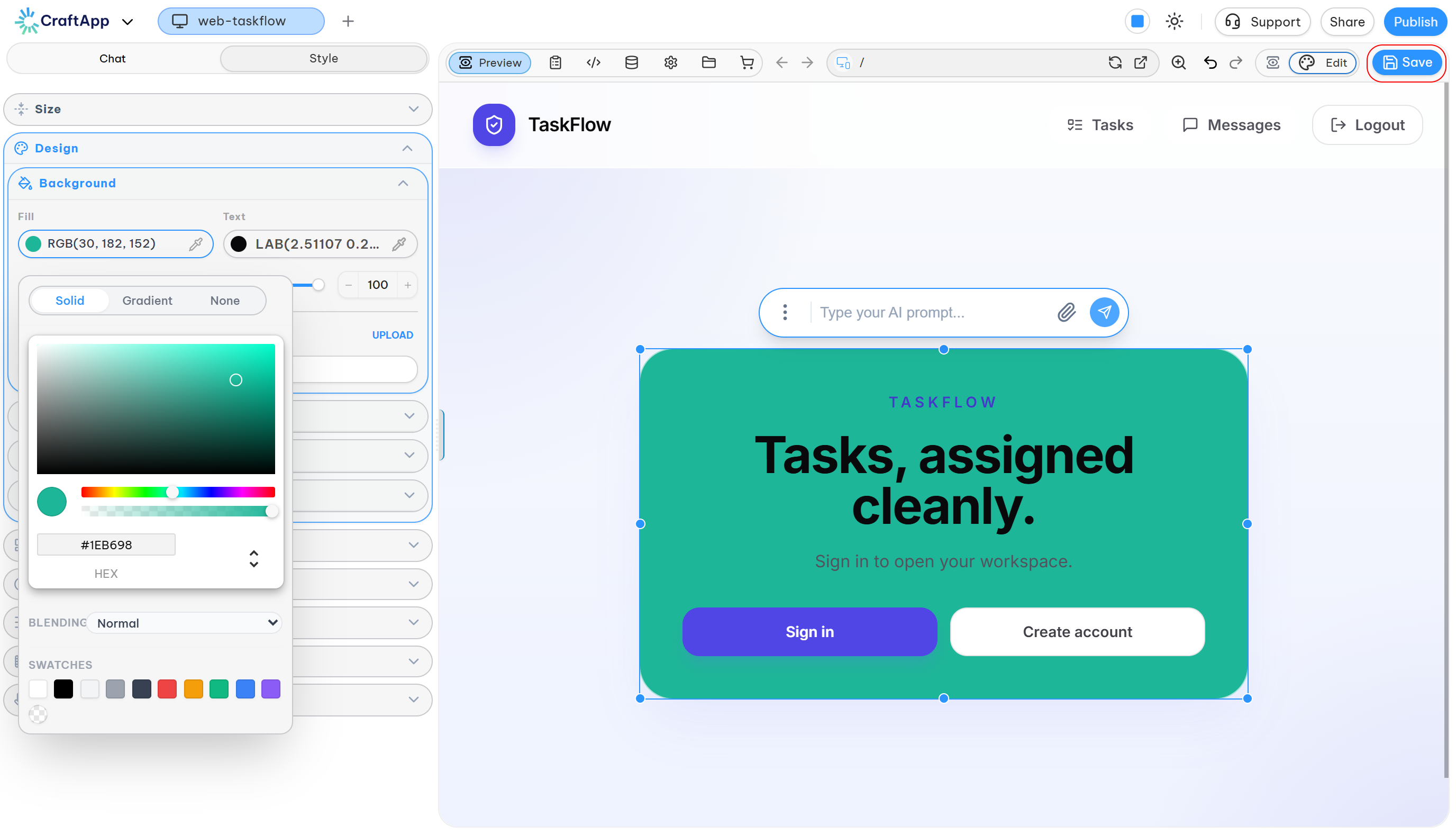
- Save: Click Save to apply changes to the project and update the live preview.
- Undo/Redo: Use
Ctrl+Z/Ctrl+Yor the arrow buttons near Save to step back or forward through your edits. - Revert: Use the integrated version history to revert the project to a previous state. This is backed by Git, ensuring no work is permanently lost.
AI Integration
The Visual Editor works with the CraftApp AI. You can generate a layout with a prompt and then use the editor to fine-tune the results visually for a fast and precise workflow.